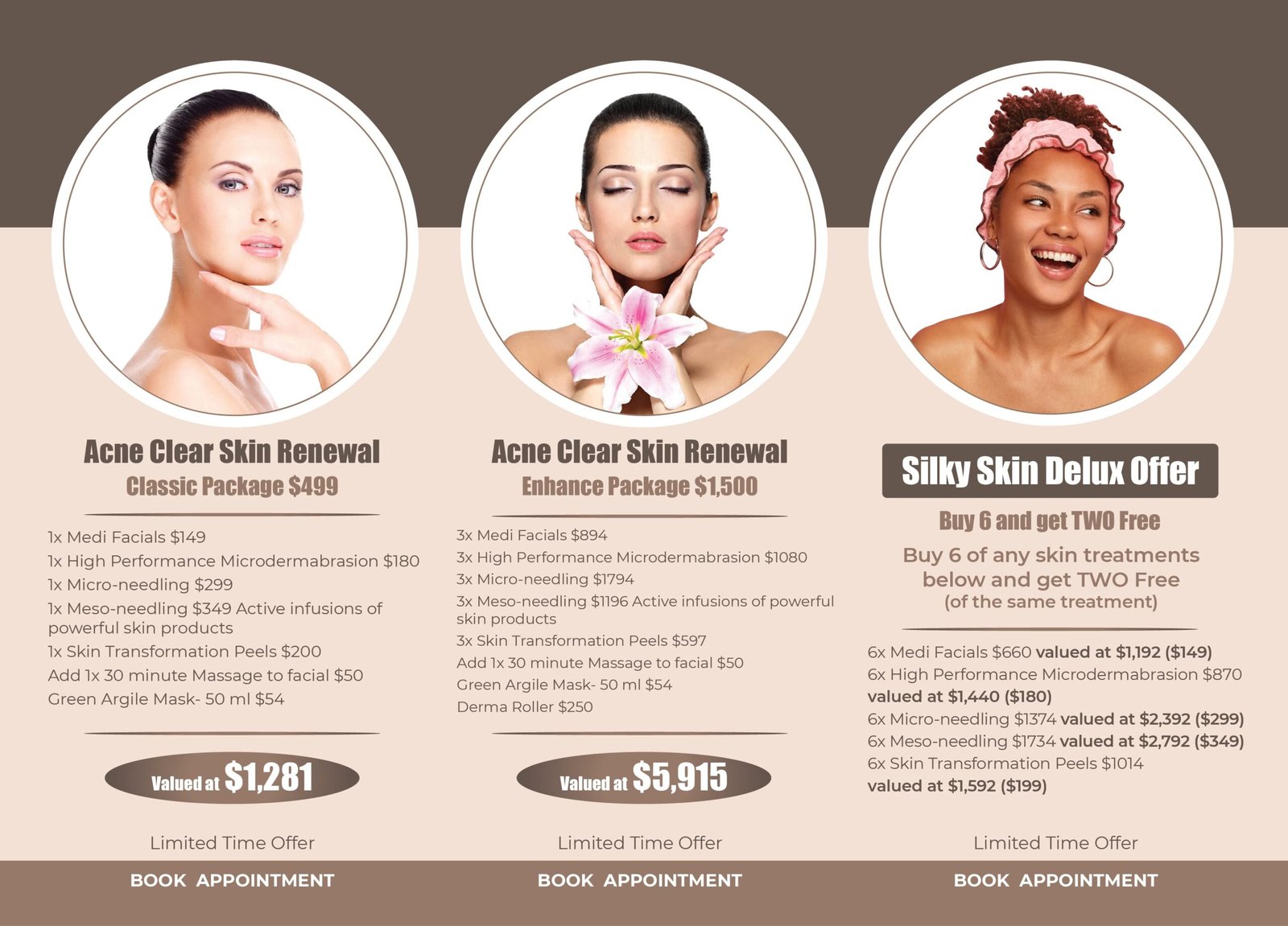
The Challenge A high-end skincare clinic needed to promote three distinct, multi-service packages with different price points. The primary challenge was to present a large amount of information—including individual services, package deals, and value propositions—in a way that was clear, elegant, and persuasive, avoiding the cluttered look of a simple price list.
Our Approach We designed a clean, structured layout using a three-column grid, allowing customers to easily compare the packages side-by-side. We chose aspirational, high-quality imagery that reflects the desired outcome: flawless, beautiful skin. To highlight the value, we created distinct visual callouts for the total value and package price, making the savings immediately obvious.

The Solution The final flyer is a sophisticated and highly effective marketing tool. It presents complex offers in a simple, digestible format that looks premium and feels luxurious. The design uses a combination of elegant typography and a clean structure to build confidence and clearly communicate the benefits of each package.
Why It Matters This design simplifies the customer’s decision-making process and effectively upsells them on comprehensive treatment plans. By clearly showcasing the value and maintaining a high-end aesthetic, the flyer reinforces the clinic’s brand positioning and turns a potentially confusing choice into an easy and attractive offer.
Client’s Reaction The client loved how the design made their packages look both professional and accessible. They reported that the new flyer made it much easier for their staff to explain the offers and saw a measurable increase in the sales of their premium packages.