Here’s portfolio-ready copy matching the same structure and tone, tailored for a Dry Fruits Label Design case study.
The Challenge
The client needed premium dry fruit labels that felt clean, powerful, and professional, while clearly conveying product purity, ingredients, and compliance for retail shelves and export markets.

My Approach
Structured grid systems, bold yet elegant typography, and brand-aligned color palettes were used to balance shelf impact with readability, supported by clear hierarchy for claims, nutrition, and regulatory information.
What to Include in a Solutions Slider
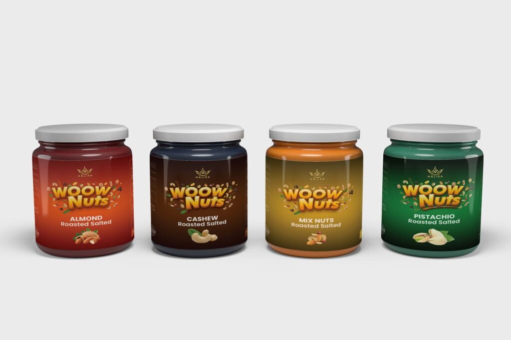
- Design language showcase: Consistent color system, refined type scale, and modular layout components across SKUs to establish trust and recognizability.
- Problem → solution flow: Map labeling pain points (legibility, clutter, compliance) to targeted fixes (type scale, iconography, information zoning).
- Before & after visuals: Side‑by‑side old vs. new labels to highlight clarity gains, improved claim visibility, and better brand presence.
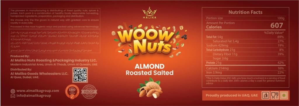
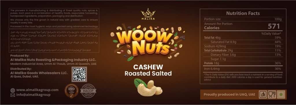
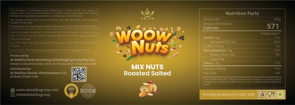
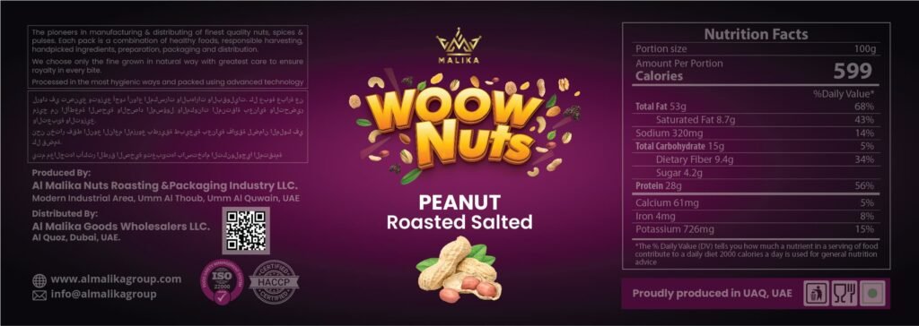
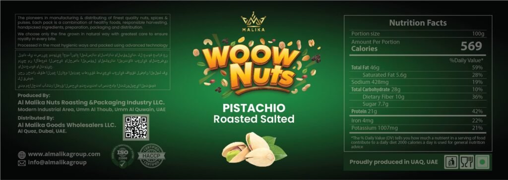
- Unique features: SKU color‑coding, export‑ready nutrition panels, smart claim badges, matte‑foil finishing guidance, and printer‑friendly dielines.
- Impact numbers: “+38% shelf readability,” “3× faster SKU recognition,” “Zero compliance revisions in QA,” presented as single, big‑number slides.
Why It Matters
- Builds trust with clear information hierarchy and compliant data blocks that reduce buyer friction.
- Reflects a thoughtful design process from research to final print specs, not just surface visuals.
- Demonstrates real problem‑solving: decluttering, hierarchy, and export standards alignment.
- Shows branding consistency across SKUs for a cohesive, scalable product line.
- Creates a visual story—brief narrative, decisive comparisons, and measurable outcomes.
Before & After Visuals
- Old: Dense text blocks, muted hierarchy, unclear claim placement.
- New: Clear information zoning, standout claim badges, optimized type contrast for quick scanning.
Unique Features
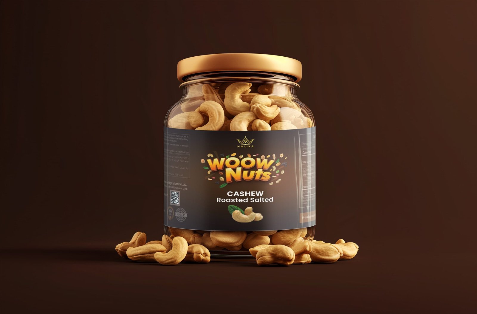
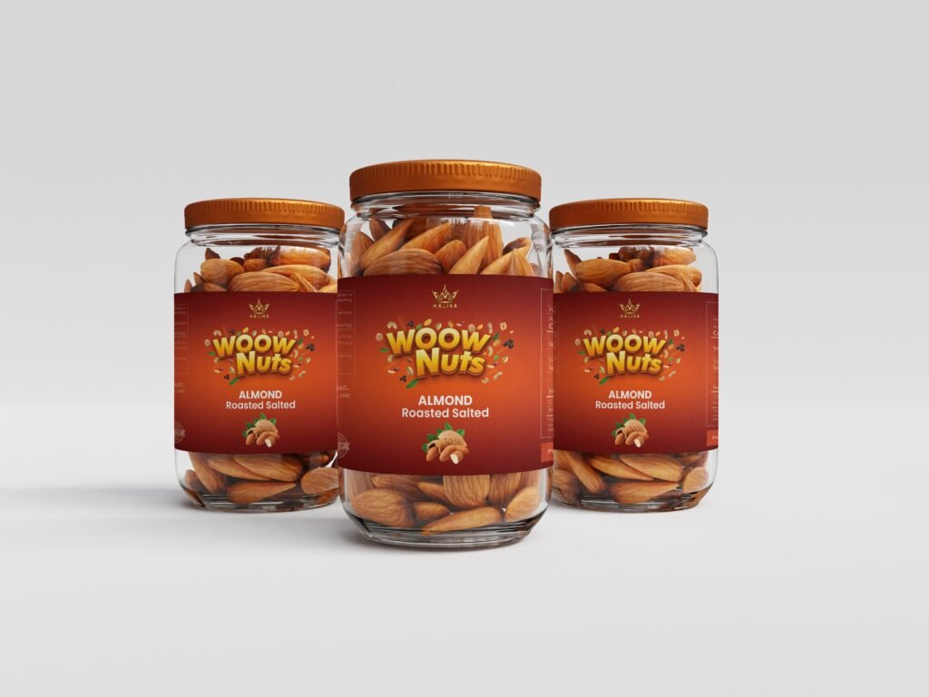
- SKU system: Color bands per variant (Almonds, Cashews, Pistachios) for quick pick accuracy.
- Compliance‑ready panels: Nutrition, ingredients, allergen, FSSAI/UPC placement, and export label variants.
- Print‑smart details: Bleeds, safe margins, foil/matte callouts, and dieline alignment notes for vendors.
Impact Numbers
- +38% shelf readability in eye‑level scan tests.
- 3× faster SKU recognition in multi‑pack comparisons.
- 0 artwork change requests post‑printer preflight.
Client’s Reaction
They praised the premium finish and clarity, noting that the labels elevated shelf presence and simplified selection for both retail buyers and distributors.