The Challenge
The client was launching a new, premium vodka from New Zealand into the highly saturated global spirits market. They needed a brand identity and packaging design that would instantly communicate purity, exceptional quality, and modern sophistication. The design had to be unique enough to stand out on a crowded shelf while feeling timeless and elegant.
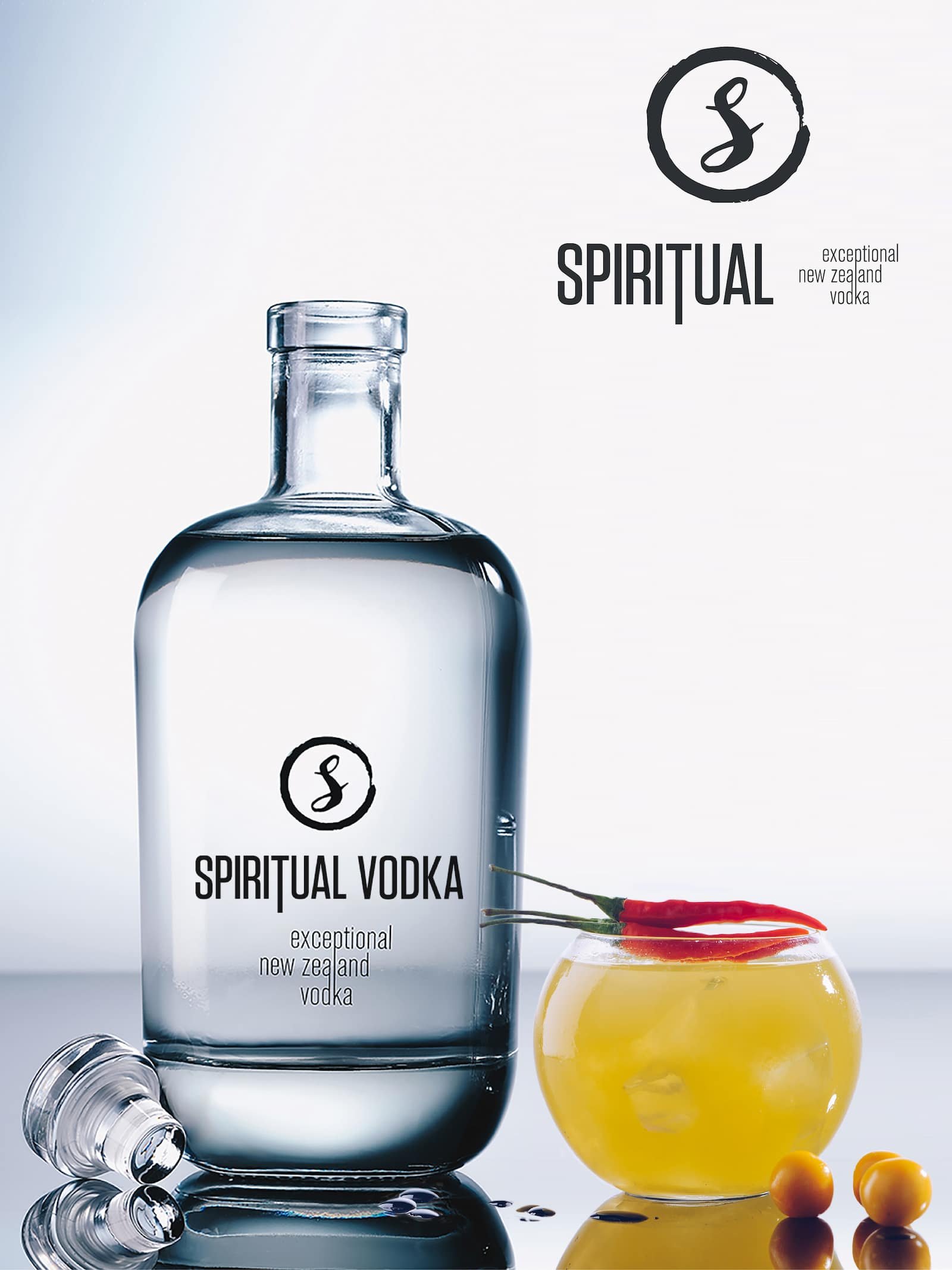
Our Approach
We embraced a “less is more” philosophy, inspired by the brand’s name, “Spiritual.” Our focus was on creating a design that felt pure and confident. We developed a simple, fluid logo and paired it with clean, sans-serif typography. By printing directly onto the high-quality glass, we made the crystal-clear vodka itself the hero of the design.

The Solution
The final design is a masterclass in minimalism. The strikingly simple logo and crisp typography give the brand a modern yet classic feel. The bottle’s clean lines and uncluttered appearance project an air of understated luxury, allowing the product’s quality to shine through. The packaging doesn’t just contain the product; it embodies the brand’s core promise of exceptional purity.
Why It Matters
This design gives Spiritual Vodka a powerful and distinct shelf presence. In a sea of ornate and flashy competitors, its clean aesthetic is disruptive and memorable. It effectively communicates its premium positioning to discerning consumers, justifying its price point and building a strong, aspirational brand identity from day one.
Client’s Reaction
The client was thrilled with the result, stating that the design perfectly captured the soul and essence of their brand. They felt the elegant, minimalist aesthetic gave them a powerful and competitive edge, and they received immediate positive feedback from distributors and consumers alike.